
Page 118 - 2015 Compass Now
P. 118
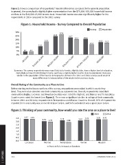
Figure 1 shows a comparison of respondents’ household incomes compared to the general population.
              In general, the survey had a slightly higher representation from the $75,000-100,000 household income
              and less in the $10,000-25,000 income level. Household income was also significantly higher for the
              respondents in 2014 compared to the 2011 survey.

                   Figure 1: Household Income - Survey Compared to Overall Population

                                                                                     Survey    Population

              30%                                    27.0  22.7
              25%                           24.6                    20.3
              20%
              15%                     17.1                                20.8               16.6 15.7
              10%            11.1                                                  13.5

               5%  4.1 4.1
               0%

                   <$10,000
                                  $10,000-25,000
                                                        $25,001-50,000
                                                                              $50,001-75,000
                                                                                                  $75,001-100,000

                                                                                                                               >$100,000

              Summary: The survey respondents were more likely to be female, slightly older, have a higher level of education,
                more likely to have children living in home, and have a slightly higher income than the population. Race was
                 similar to the population. Differences in demographics between the 2011 and 2014 surveys could result in
                                         many differences in interpretation of the results to the previous study.

              Overall Rating of the Community as a Place to Live

              Before starting on the issues sections of the survey, respondents were asked in which county they
              lived. They were also asked to rate their community as a place to live. Overall, respondents rated their
              communities highly. La Crosse and Houston Counties were rated the highest, and Monroe and Trempealeau
              Counties were rated the lowest (see Figure 2). There was a significant decline in ratings of their community
              between 2011 and 2014 by respondents in Trempealeau and Monroe Counties. Overall, 35% of respondents
              reported their community was an excellent place to live, and 54% indicated it was a good place to live.

              Figure 2: Thinking of your community, how would you rate the area as a place to live?

                                                                                         2011                                             2014

              3.5 3.37 3.35  3.02 2.93      3.14 2.88                     3.12 3.22          3.31 3.32
              3.0              Monroe
              2.5                           Trempealeau                   Vernon             Houston
              2.0
              1.5
              1.0
              0.5
              0.0 La Crosse

                             1=Poor; 2=Fair; 3=Good; 4=Excellent

1 | APPENDIX  110 COMPASS NOW 2015